Search

Joshua George Photography

A glimpse into my view

Tag

focus

In the Studio trying out stuff

Here are my original images from a shoot I have done in the studio using light drawing and gel lights to form images of a communicative nature.

Below are the images I have formed using a gel light and a touch by  drawings around my model. I think this images look very creative due to the way I have formed the light around her body and by the way I have positioned her but I do think I can improve by drawing the light more sturdily and by having more of a theme to the images as I feel not all of the images connect with each other.

I have also decided to do some simplistic, dramatic images of sea objects to saw a different view of ideas for me to form my work into. e.g a simple shape sounded with black conferring a message to the viewer.

I think I could have improved these by maybe having more of a selection of objects and by using more simple objects to tell a story e.g having a set of dolls or watches that all connect to tell a story as this didn’t really connect due to the lack of objects.

Brick Lane

Here are images I  have taken of graffiti in Brick Lane to inspire ideas into communication and, to help me think of more exciting ideas within my FMP to do with colour, texture and how to get my message across to the subject/ viewer. I have decided to try maybe a street feel within my photography when I am creating my final images or by making the photos look bright and colorful like a painting to make them interesting to the viewer.

About the magazine text/ layout.

  • Layouts 

The way in which text or pictures are set out on a page.

  • Baseline Grid

The baseline grid is a technique used to better your web-based typography. Essentially, it aligns all your text to a vertical grid where the bottom of each letter is positioned onto the grid, just like writing on lined paperBalance – Symmetrical & Asymmetrical

  • Folio

The folio is the writing at the bottom of the page usually the date or the magazine number.

  • Formatting

 The arrangement of data for storage or display.

  • Margins

Is the edge or border they help to form a grid.

  • Body copy

Body copy is the main text part of an advertisement or any printed matter (as distinct from the logo, headline, subheadings, and graphics) that provides the ‘meat’ of the communication. Usually a professional copywriter writes the body copy.

  • Drop Caps

A drop cap is a decorative element typically used in documents at the start of a section or chapter. It’s a large capital letter at the beginning or a paragraph or text block that has the depth of two or more lines of normal text. Drop caps are easy to apply in Word.

My awesome Facebook page

Link below to my fantastic new Facebook web page.

https://www.facebook.com/joshuageorgephotograthy/#


2017-02-18.png


Different text fonts I should have on my website/ Mag

bold font 

I think I should use bold text as I think this would improve the way the viewer see the material and within the way the titles / most important information stands out to the lower forms of text.

Serif

A typeface with serifs is called a serif typeface (or serifed typeface)  are thought of as more modern and contemporary. The fine details of serifs, especially the more delicate and high-contrast designs, don’t always display well on screens, especially at small sizes on low-resolution displays.

Image result for serif font

Old Style

I would use an old style type face as I think this would complement my imagery. I also think this would make my photography look more attractive to the eye.

Image result for old style type

Glyphic font

Is an elemental symbol within an agreed set of symbols, intended to represent a readable character for the purposes of writing. As such, glyphs are considered to be unique marks that collectively add up to the spelling of a word, or otherwise contribute to a specific meaning of what is written, with that meaning dependent on cultural and social usage.

293px-A-small_glyphs.svg.png

Italic text

I would use Italic to highlight important text within my work as I think this will help highlight important parts within my work and to show interesting information.

which one is the best?

Image one

final

Image twoIMGP1536 edit

Image threeIMGP1539 edit

Image four_ro14994

Image five_ro14873


Album cover practice

These are screen shots of my work progress I have done when creating my practice album covers.

screen-shot-2016-11-28-at-12-29-36

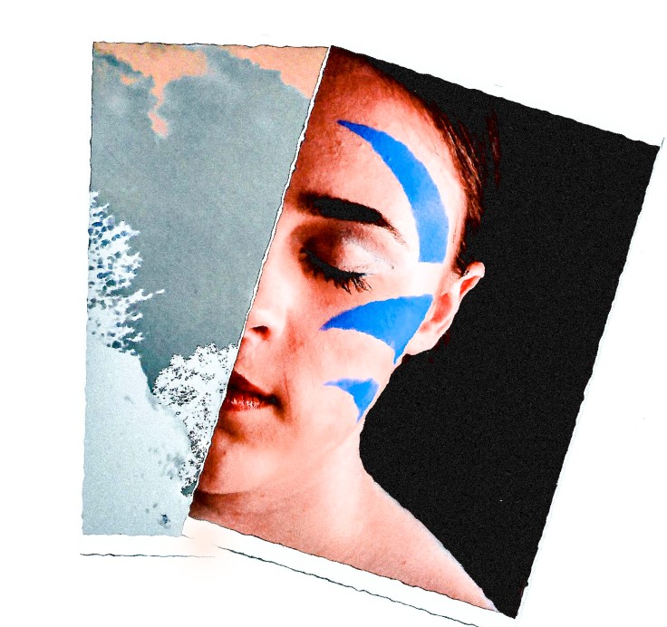
I started my first cover by first darking the shadows and the contrast within her face to make her features look more striking. I did this by using  adobe bridge to up the blacks , shadow and to lower the highlights within her eyes and near her mouth to make her standout within my cover. I then decided to bring the image into Photoshop where I used the square select tool to select her mouth and eyes.

screen-shot-2016-11-28-at-12-29-46

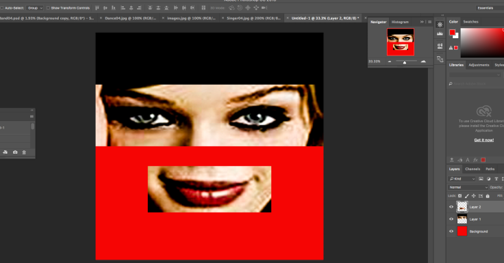
I then  made a new blank page  were I changed the background layer to red and black using the paint bucket as the colors are very complementary and I thought they would help express the image.I then decided to place the mouth and the eyes into the new document and using the free transformation tool I was able to position them within the cover.

screen-shot-2016-11-28-at-12-35-35

I then decided to add text within my album cover so I used the text tool to make a text box within the left hand corner and at the middle below the mouth and placed the writing (Cambridge and Right here and right now) within them using a computer, retro style text.


This is my next cover that I created I based it on the rock genre as I wanted to make the cover look intense and different. I did this by choosing an image that showed a person that showed a feel of rock and shadowy temptation.

screen-shot-2016-11-28-at-12-13-53

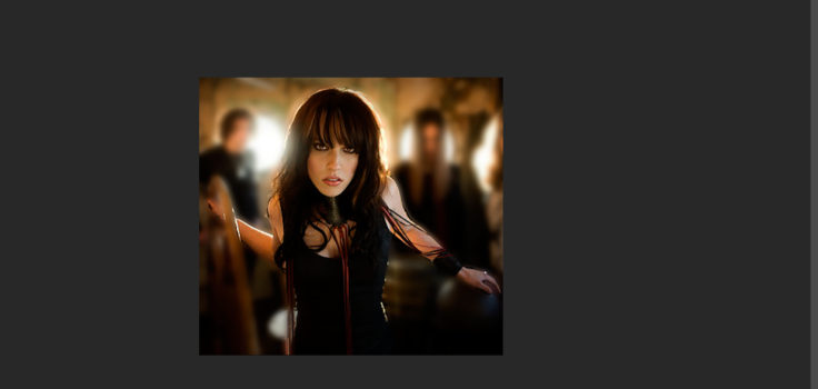
Once I had done this I then decided to use the magnetic lasso to select the outlines of her body and then inverted the selection to have the background selected and I then used the Gaussian blur to blur out the background.

screen-shot-2016-11-28-at-14-58-28


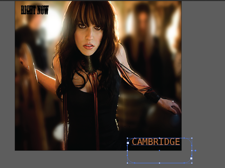
After this I then decided to place in the text  to show what the album was about and to help express my image. screen-shot-2016-11-28-at-15-05-30

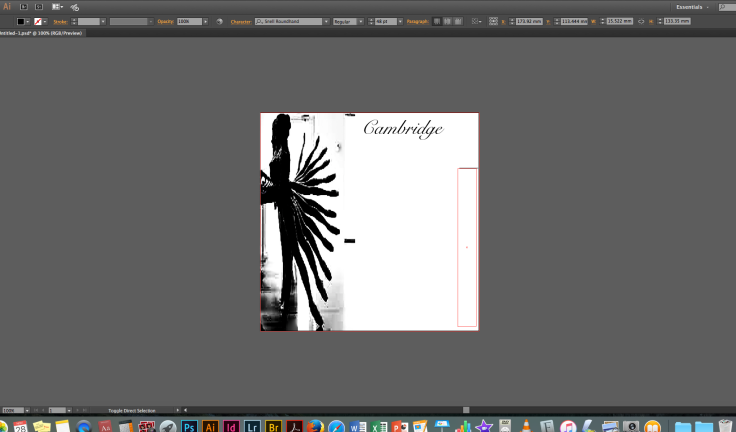
I then decided to change the layout of the text and to edit the original image within Photoshop as there was some difficulty in seeing the text from the background i did this by pressing the edit original button within illustrator.

screen-shot-2016-11-28-at-15-05-35screen-shot-2016-11-28-at-12-42-31

I wanted to show within this image a feel of classical but at the same time an emotion of the blues within the image I did this by selecting an image that showed a woman who looked lonely but at the same time important and when manipulating her I then decided to invert the image to make her colours look sad and unrealistic to the eye. I also decided to crop her inwards to take away her dress and to focus more onto her face.

screen-shot-2016-11-28-at-15-37-25

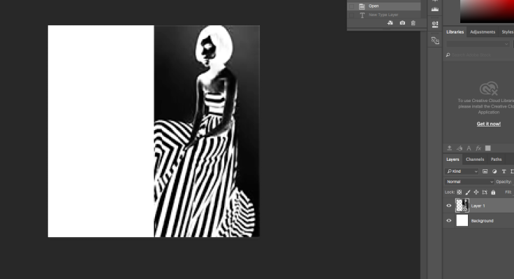
I then placed it on to a new blank layer that was white and started to experiment with text.

screen-shot-2016-11-28-at-15-37-07

In the end I decided to have the text at the side in black with the title below in read as I thought this would draw the eye of the viewer and make them look more towards the image.screen-shot-2016-11-28-at-14-42-55screen-shot-2016-11-28-at-15-19-35

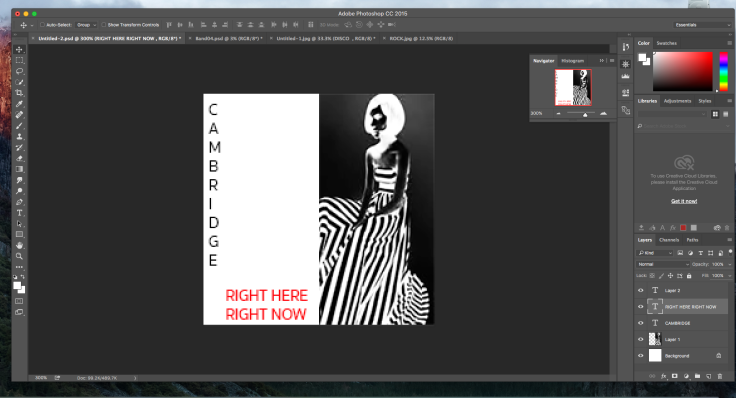
This was my last album cover I decided to base this meanly on classical music as I thought the dancers suggested a softer theme within the image.

I started this by turning the image black and white and then cropping the photo I then placed it on to a new blank page and turned my thoughts to the text. I wanted the text to show a posh and higher class feel within it so I decided to try old style text as I thought this looked really interesting within the cover.

Screen Shot 2016-11-28 at 15.48.51.png

Hierarchy Of Information and Composition

“Designers can create normalcy out of chaos; they can clearly communicate ideas through the organizing and manipulating of words and pictures.”—Jeffery Veen, The Art and Science of Web Design


Visual hierarchy refers to the arrangement or presentation of elements in a way that implies importance.  The term visual hierarchy is used most frequently in the discourse of the visual arts fields, notably so within the field of graphic design.

Size

When you are creating you need to make the main image or text that is the main focus the biggest and the ones that are not smaller so they do not draw the eye from the main subject. E.g the biggest photo or main form of information.

Like within the poster above you can see this happening with the image of the man and woman kissing in the corner as this is the largest within the poster drawing the eye away from the other less important subjects and towards the hero of the movie. It is also made more aware by the text “touch of evil” that is bigger then the rest within the poster and has been changed to a different font to the other text to make the viewer more attracted to the image.

Colour

Colour is an interesting tool because it can function as both an organizational tool as well as a personality tool. Bold, contrasting colors on a particular element of a website will demand attention (such as with buttons or error messages or hyperlinks). When used as a personality tool, color can extend beyond into more sophisticated types of hierarchy; Using lush, comforting colors can bring an emotional appeal to a page. Color can affect everything from a websites brand (ie: CocaCola Red) to symbolism (ie: cool, subdued colors).

coca-cola-art_christmas_santa6.jpg

Contrast

Contrast shows dramatic change within the text and shift within the size or colour showing there is something different within the writing.

visual hierarchy in web design

Alignment

Alignment creates order and a since of constancy within the text.This is usually achieved with a grid to make it easier to plan out the text within the design.

composition

In the visual arts, composition is the placement or arrangement of visual elements or ingredients in a work of art, as distinct from the subject.

  1. Focus point

    01_Focus1-662x993.jpg

One of the key things within composition is focus points as you need to find a spot within the image were you want the viewer to look at like above the main focus point is the woman.

2. Direct the Eye With Leading Lines

Using lines you can direct the viewers eyes to a new part of the paper to see a new subject or more important parts of information within a poster.

02_LeadingLines2-662x1009.jpg


3. Scale

Scale is often used to help communicate hierarchy by drawing attention toward and away from certain elements, thus signifying their importance to the communication.


03_Scale2-662x938.jpg


4.Use Elements That Complement Each Other

05_Complement1-662x488.jpg

This is done by using images that follow a theme within the poster or design and making them an ongoing subject within the visual content . You also need to make the text mach and follow this images to make the story work with the images.


10 Rules of Composition All Designers Live By

https://webdesign.tutsplus.com/articles/understanding-visual-hierarchy-in-web-design–webdesign-84

Design Principles: Compositional Balance, Symmetry And Asymmetry

Blog at WordPress.com.

Up ↑