Search

Joshua George Photography

A glimpse into my view

Tag

word

Some of my Card

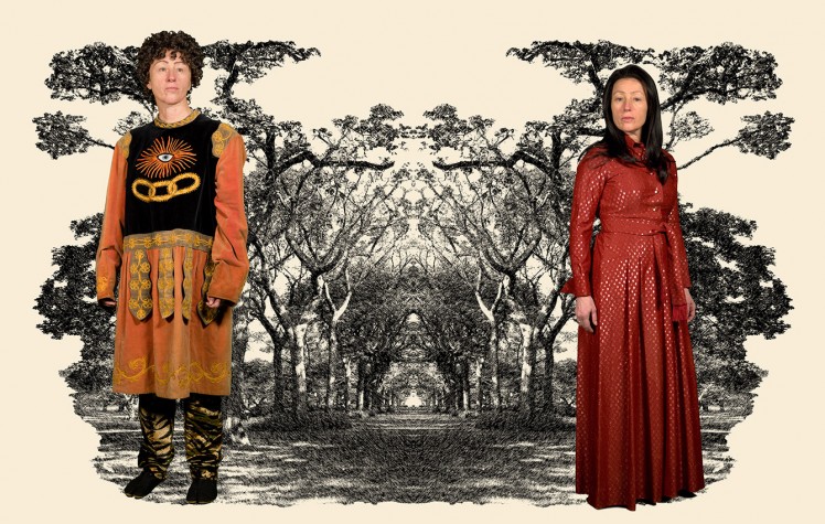
Here are my images I have constructed for one of my ideas for my FMP I think I may use this idea as I really like how it connects to communication within the was the images are disguised as sensory cards  informing the viewer what it is within the image displayed within them and within the way the idea has a range of different techniques within them allowing me to have a free rein over how I want to take / design my cards.

confused

I started my image above by first creating  my photo of the girl within a confused state of mind by having my model stand in the middle of a set up studio with a gel light that was projecting orange light upon her. I then took the image on a slow shutter of 10 seconds while she moved her head to add a sense of blurriness and confusion within the image.  After this I then placed the image into camera raw were I manipulated the image and removed the blemishes within the background. Once I was happy with my editing I decided to place it into inDesign to finish off turning it into a card by first  making a square template to make the sides even to the eye. I then used the square tool to make a square that covered the background within this square I placed the colour black to form the background. I then used the frame tool to place in the image of the confused girl into the black background within a square frame, I also placed a pink box under the image using the shape tool for the text and to capture the eye. I then decided to add texture to the box at the bottom by using the polygon tool to add these shapes multiple times within the pink box I then decided to manipulate the ankers within this shapes using the pen tool and the direct selection tool to change the shape of the objects making them more modern to the eye. The thing I like about this cards the way the colours complement each other and the way the lines and shapes make the eyes travel towards the main image within the card. doggienewformat

I also tried making a very simple design when making my cards as I wanted to see how this would change my images point of view. I found the image to stand out more to the writing and the writing  looked less distracting to the eye without objects around it but I decided against this option as I thought it was too simple for my idea and I thought it didn’t express my ideas too much, as I wanted the viewer to have to search within the piece looking for an answer to their questions showing my message of communication and dis-communication within the card.


frindship

For my next image I decided to use the same format but to change some elements within adding two lines within the piece framing the writing  and by making the text smaller , changing the colour and more connected to the background. I also looked at changing the sizes of the lines to change the way the eyes would engage with the image by making the top line bigger then the bottom one and slightly off from each other to attract the eye inwards to the text.

seaworld

For this image I decided to make it related to sea life as I wanted a variety within my images and I also wanted something that would standout from my other cards. I also wanted my image to hide different meanings within it like lonesomeness, feeling blue and hard to talk to but I wanted it to be something the viewer had to find / express for themselves. When creating this image I decided to use the shapes tool to make a pattern within the box below the image to hide the text and to confuse the viewer to make them search for a message that would relate to the image but wouldn’t help them to explain what it was as they needed to find it out for themselves.

travle

when doing this image I wanted to show movement and travel within the image and within the card so I decided to use my image of my double exposure to show movement giving the viewer the ideas they were on a journey. I also decided to make a complicated and missed up text box below using shapes and lines to give the feeling of confusion and chaos to the viewer. I think I have done well within this image above as I feel it draws in the viewer with its different textures and feel of atmosphere within certain parts.

Now online for the magazine

Here is my online magazine.

Research into photographers

Cindy Sherman

Cynthia MorrisCindySherman (born January 19, 1954) is an American photographer and film director, best known for her conceptual portraits. In 1995, she was the recipient of a MacArthur Fellowship.

P11437_9.jpg

untitled , date: 1975

untitled, date: 2010

Shortly after her birth, her family moved to the township of Huntington, Long Island, where her father worked as an engineer for Grumman Aircraft.Her mother taught reading to children with learning difficulties. In 1972, Sherman enrolled into the visual arts department at Buffalo State College, where she began painting. She would on occasion dress up as alternate characters and go out to the town like this. Frustrated with what she saw as the medium’s limitations, she abandoned the form and took up photography.


Screen Shot 2017-03-24 at 10.24.38

I think Cindy Sherman photography is very formal within the way she lays out her subjects within her work making it look as if they have been positioned within a manner to capture the eye of the viewers to the image.I also like this as she mainly uses herself within her photography or a feminine presence making her images have a lighter side within them comforting feel to them.

Links

https://www.moma.org/interactives/exhibitions/2012/cindysherman/gallery/mural/#/5/untitled-2010-3

http://www.tate.org.uk/art/artists/cindy-sherman-1938

Barbara Kruger

Barbara Kruger (born January 26, 1945) is an American conceptual artist and collagist. Much of her work consists of black-and-white photographs overlaid with declarative captions—in white-on-red Futura Bold Oblique or Helvetica Ultra Condensed. The phrases in her works often include pronouns such as “you”, “your”, “I”, “we”, and “they”, addressing cultural constructions of power, identity, and sexuality. Kruger lives and works in New York and Los Angeles.

https://uploads8.wikiart.org/images/barbara-kruger/untitled-questions-1991.jpg

Questions , date:1991


Untitled (your body is a battleground), 1989 - Barbara Kruger

Date: 1989

Talk with the artist Barbara Kruger on YouTube.

I think Barbara’s work has some structure of Dada within it as she has constructed her work using different forms of magazines  and photography using collage techniques to form her work. I also like the way she has placed text within her work that reflects her art and complements its ability’s.

links

http://www.tate.org.uk/art/artists/barbara-kruger-1443

https://www.wikiart.org/en/barbara-kruger/untitled-your-body-is-a-battleground-1989

Nick Knight

Nick Knight OBE (born 1958) is a British fashion photographer and founder and director of SHOWstudio.com. He is an honorary professor at University of the Arts London and was awarded an honorary Ph.D. by the same university. He has produced books of his work including retrospectives Nicknight (1994) and Nick Knight (2009). In 2016, Knight’s 1992 campaign photograph for fashion brand Jil Sander was sold by Phillips auction house

Screen Shot 2017-03-24 at 11.00.52.png

Screen Shot 2017-03-24 at 11.01.09.png

Screen Shot 2017-03-24 at 11.01.54.png

I think Nick Knight’s work is very different to other fashion photographers work due to the facts he adopts other material within his images that aren’t usually seen within photography like paint, makeup and plastic to disfigure the models and the image to the eye.

links

http://nickknight.com/

https://en.wikipedia.org/wiki/Nick_Knight_(photographer)


Paris Photo

Here is a leaflet I designed for the Cambridge regional college to promote the pairs photo trip. I think I have done well within creating this as it is bold and crisp to the eye and makes the viewer’s eye travel around the design.

WP_20170324_09_13_50_Pro.jpgWP_20170324_09_14_11_Pro.jpgWP_20170324_09_14_06_Pro

Wonn17

This is my magazine I have designed and made for my Wonn 17 project. I think I have done well within constructing this as I didn’t really know how to use indesign and I found it difficult to get the layout and typefaces within my magazine to look professional to the eye. I started constructing this by opening inDesign and arranging my magazine layout to be 12 pages and for the grid to have 6 columns and 4 rows within it to help with placing text and images within my pages. Once I was in inDesign I then used the master pages to change the colour of the background within the magazine to black and to add the page numbers by making a text box within the corner and selecting  the add page marker within the edit bar.

Screen Shot 2017-03-14 at 16.27.51

This is my front cover I like the way I have constructed it as it draws the viewer towards the image with the way the writing has been formed in a right angle format making you look around the page. I did this by first placing the image within the middle with a box and then thinking about the layout of the text as I wasn’t sure how this would look with text around it so I experimented. I then decided that the best text for my front cover would be simpler text that would work more  with the image so I decided to work with a font that was something like Sans  within the title and to use reds and pinks to compliment the dark colour’s of the background. After this I then used lines and shapes to add more feeling to the page by creating  a border around my image and to underline the title to give it its own life.

Screen Shot 2017-03-15 at 15.39.31.png

I started the first page within Wonn17 by placing an image of the Cornwall cost that I took within the first two pages and then making up an index and a space about what the book is about by writing  within text boxes then placing them within arranged areas that suited the layout.I then decided to add a quot by a famous photographer or artist in the end I decided to use a quot by Twyla Tharp as I found her quot very inspirational and suiting to my magazine. I then placed the quot in by drawing a line across the page and using the horizontal text tool I then write in the quit on to the line. I then used the pen and the selection tool to manipulate the text to curve around the photo within the background. I then decided to finished off my page by placing some boxes within my page behind my text that were light and dark pink to help the text stand out and to give it a border to the eye.Screen Shot 2017-03-14 at 16.32.45I first started within these pages by thinking about how my image would sit to the text as I wanted the pages to combined features of each other and to make the viewer have to wonder around the page within an arranged infrastructure. I did this by fist placing my image on the left hand side then with the shape tool, I then placed  a square behind it that i then turned  white  to make it standout from the background. I then turned my thoughts to the text , I decided I didn’t want the text sitting there on the black background so I decided to create a group of coloured squares with the shape tool to decorate the background and to make the text standout to the eye. after this I then placed in the text using the text box and the grid to arrange them within my squares, I also decided to make their colours white and orange as I thought this went well with the colours of the squares. I then finished it off by placing two coloured lines throw my image to attract viewers to look at my image as it points to the photo and to make the pages connect to each other. Screen Shot 2017-03-14 at 16.33.14

this is my favorite page due to the background as I created this by using the shape tool and drawing hexagons then arranging them within a way that looked retro to the eye. I did this by first placing them behind the image I then decided to change their colours to a form that would match the colours within the photo. I also added lines within the shapes by placing smaller shapes within the hexagons and then getting rid of their fill and upping their outlines. once I had placed in all the shapes within my pages  I then placed in my text boxes for the title and for the text. I did this by making two coloured squares keeping to my theme and placing the text within each of these. I also added a thin pink line under the title (confused baby pie) as I thought this would help people’s eyes travel towards the photo and to the title.Screen Shot 2017-03-14 at 16.33.45

For this page I decided to keep it simple as I wanted a page were the image was the only subject within the pages and the viewer didn’t have any writing nor shapes to see within the page except that within the photo so  I decided to only have the detail of what the settings were when the image was taken within the corner of the photo on the page making it simplistic as I could.Screen Shot 2017-03-14 at 16.34.10

I started this by frist placing the image within the middle of the two pages and moving it slightly to the left I wanted the image to be the biggest thing within the pages as I wanted it to be the most dominant piece within the pages compared to the text and shapes. I then decided to place in the shapes within the background to add a feeling of colour and a feel of retro within my piece. I did this by using the shape tool to make squares then  arranging them in a slanted angle to the left corner to the right making a line. I then decided  to form a collection of boxes within the right hand side for the text and the title adding feeling and texture to the page. I then decided to use the line tool to add lines under the title leading to the image making the viewers eyes travel to the photo and take their time within the page.

Screen Shot 2017-03-14 at 16.34.37

I wanted these pages to show a tight frame within the way they were laid out so I decided to start developing this by  creating the background using the squares like the other pages. I then placed in the title within the right hand top corner . After awhile I decided to change the layout of the title as I felt it didn’t look professional and wasn’t showing respect to the image so I decided to change its layout by having the (on the ) in smaller writing and different colors away from the rest of the title to make it look less important and to uplift the rest of the title. the image I placed within this was made with a speed light and a colour gel I created this within a beach in Cornwall.

Screen Shot 2017-03-14 at 16.34.58

This is another page I decided to make in a simplistic manner as I thought the image would look better in a bigger format and the page would look more suitable with less writing within it so I decided to place the settings I took the image within the right hand bottom hand corner and I then decided to make a title for this within the right hand side going done by using a line then writing the text down on the line.

Screen Shot 2017-03-14 at 16.35.20

I decided to have a bio within my magazine as I thought this would add character into my magazine and would make the viewer understand me more within my pages. I did this by placing a self portrait of myself within the left hand side. I then placed a text box next to the image of me and place the bio I was working on within this to express me. I then decided to create a title by making a white box above the writing and having a bold red line half way to the bottom to cut the box from the text and to make the title stand out from the other words within the page. when placing the words within the title I decided to make them three different colours as I thought this would make the viewer’s eye follow the page better and would make the page look more organized to the eye.

Screen Shot 2017-03-14 at 16.35.37

I decided to make my back cover based on my logo for my promotional project as I wanted it to promote me but at the same time look stylish and retro so I decided to use the grid system to layout two squares within my back cover wich were orange and white . I then manipulated them and added to red lines over them to each sides to make a border, making the images look as if it was a frame or a piece of art. I then decided to add in the logo and to writ within small letters underneath ( sponsored by )  as I thought this added to the photo and gave feeling to my work. Continue reading “Wonn17”

Mags experiment

To find my skills within inDesign I decided to uses a number of different magazine covers to replicate within my own image to gain my ideas on how to create my own cover within my own magazine.

ec4446fc.jpg

I decided to use the GQ British fashion magazine  to start with as I wanted to first try something that showed some form of similarity within the writing to start with.

Screen Shot 2017-02-08 at 15.22.42.png

I started creating this by placing in one of my own images that looked simpler to the original image. I then decided to place down a grid by going to insert create grid to form a grid for me to work with. After this I then  decided to add the logo by placing a text box within the left top side corner then placing GQ within it and increasing its size , changing its font and colour to make it like the original.

After this I then added in the text by placing in the text boxes in the left and right sides of the magazine cover and filling them with text from the original magazine that I copied in. I think I have done well within this in capturing a close  similarity with the original magazine cover as I think I have done well within positioning the text and with finding simuler font.   Jack-OConnell-Hunger-Magazine-2016-Cover-800x1042.jpg

My second cover was from the magazine hunger as I wanted a simplistic image to give me an ideas on how to arrange my covers within a simplistic manner that would internet my viewers.

Screen Shot 2017-02-06 at 11.47.10.png

I started copying this by creating the background within inDesign by using the rectangle tool to make a square to cover the whole of the background I then changed the colour of this to a light hue of pink. After this I then decided to place a grid on top of the page to help me arrange my text and imagery within my own cover. I started this by finding one of my images that I thought would suit the type of cover and then placing it within the center of my page using the grid I had just made to help me arrange it in the center. After this i then placed the title within the cover by finding a font that was similar to the one in the cover i was copying. I went for a Sans font in the end as I felt this was bold and more like the text within the original magazine cover within shape and texture. I then decided up the size of the title and  to reorganize it to fit with the original.After this I then placed the text within the cover using text boxes and arranging it using the grid.


Unknown.jpeg

This is my seconded hunger magazine cover I recreated using inDesign .

Screen Shot 2017-02-08 at 15.21.11.png

I decided to use my image from  Audley End as I thought this looked more like the image on the front cover of Hunger and I also liked the way his facial features were acting within the photo. I started this image by first making a grid then placing the a box around the whole of the page and inserting the image creating a background. After this I then decided to work on the title by using the pen tool to draw on the words and the manipulating the words with the selection arrow to make them look more artistic. I then added lines under the writing to make the image look as if it was paint dribbled. I think I can improve within my cover by working more within the title as I think it looks untidy to the eye and I think I need to paint the letters by hand then scan them in to make them look more life-like.

images-1.jpeg

I decided to copy the Vogue Paris cover as I liked their design compared to the British version.

Screen Shot 2017-02-06 at 12.23.23.png

I started to replicate the original by first placing my photo I thought looked most like the original  within the background  then placing a grid on top to help place my text within my cover.I then decided to place the title within the cover by making a text box with the top of the cover then placing the words Vogue . I then increased its size and changed its colour and font to one that represented the original. after this I then made the Paris by drawing a small text box within the O of the Vogue and writing Paris, after this I then changed the font to an old style and the colour. After this I then started to add in the text by inserting text boxes within may cover then placing text from the original cover within them and placing them within the right arrangement of the cover.  After this I then manipulate the text by changing its arrangement,size,font type and colour.  To finish this off i placed a box within the corner and placed a bar code to make it look real.


images.jpeg

With this cover I decided to go for a simple cover as I wanted another cover that expressed how you can create a cover in a manner that is simple but recognizable to the public.

Screen Shot 2017-02-08 at 15.16.00.png

I did this by making a A4 page in a landscape layout, then placing a box over the whole of the background and inserting one of my image of a man. After this I created the title by placing a line horizontally down the page I then used the text box tool to stick to the surface of the line allowing me to type horizontal down the page the I-D. I then made sure the text was the right shape size ,font and placed it to match the original. I think I have done well within this by getting it very powerful within the way the image looks at you and the way the text is entered identical to the original.

!BpI1Np!!Wk~$(KGrHqYOKi4Eub(TrSnzBLqJhO47+g~~_35.GIF

For my last cover to copy I decided to copy a very artistic cover from I-D as I wanted to gain some idea on how to form a more art based cover then just a photography based cover.

Screen Shot 2017-02-08 at 15.24.17.png

I first started this cover by first placing the image over the whole of the cover I then placed  the grid on top as I decided to use this to help within arranging my text within my design.

After this I then made the title by placing the text box in the top hand corner and placing the words I-D and changing its font face,colour and size to fit the same as the originals. I then turned my attention to text and how to lay this out within my own make by placing the text boxes within the layout of the cover and then placing text from the original within it. I also tried to do the  curve writing within the original but I struggled to make this as I  couldn’t figure out it at the time how to turn the text but I did manage to find out this latter on within a later cover.  I finished this off by creating a bar code within the left hand corner by inserting an image of one from the internet then resizing it to fit the size of the layout of my cover.


How to arrange images within inDesign.

Screen Shot 2017-02-24 at 13.23.03.png
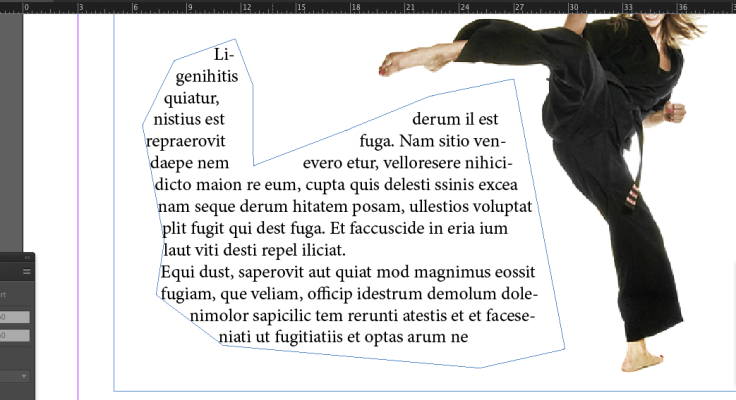
This is the tool used to arrange text around images within inDesign you use this by selecting an  image then getting the tool up within the windows bar and using the arrows to move the text around the image.

Screen Shot 2017-02-24 at 11.23.07.png

I started practicing this by making a square using the rectangle tool within the center. I then placed a text box within the whole of the page and filled it with placeholder text. After this I then used the text wrap to adjust the square and to mess around with the positioning.

Screen Shot 2017-02-24 at 11.25.13.png

after this I then tried this on a circular shape to see what would happen. by placing a text box over the whole of the page as before and then placing a circle in the middle using the circle shape tool. I then used the circular text wrap to make a circle border around the circle from the text.

Screen Shot 2017-02-24 at 11.32.00.png

after trying out the text wrap with shapes I then decided to try this onto a real image by inserting an image without a background within a page of text that I had placed down like before. I then selected the image and went to the text wrap and changed the type button to detect edges so the image would be selected instead of the outside. I then used the selection arrow and the pen to manipulate the anchors within the border pushing out the text. Screen Shot 2017-02-24 at 11.38.35.pngScreen Shot 2017-02-24 at 11.47.45.png

I made the text in the unusual text box above by using the pen tool to form an uneven shape  near the image making sure all of the lines were connected. I then selected it and inserted placeholder text within it turning it in to a text box.

Screen Shot 2017-02-24 at 11.50.15.png

After this I decided to move some of the anchor within the shape by using the selection arrow to move anchor manipulating the shape of the layout of the text and I also decided to remove some of the anchor by selecting them and pressing the delete button changing its shape.

About the magazine text/ layout.

  • Layouts 

The way in which text or pictures are set out on a page.

  • Baseline Grid

The baseline grid is a technique used to better your web-based typography. Essentially, it aligns all your text to a vertical grid where the bottom of each letter is positioned onto the grid, just like writing on lined paperBalance – Symmetrical & Asymmetrical

  • Folio

The folio is the writing at the bottom of the page usually the date or the magazine number.

  • Formatting

 The arrangement of data for storage or display.

  • Margins

Is the edge or border they help to form a grid.

  • Body copy

Body copy is the main text part of an advertisement or any printed matter (as distinct from the logo, headline, subheadings, and graphics) that provides the ‘meat’ of the communication. Usually a professional copywriter writes the body copy.

  • Drop Caps

A drop cap is a decorative element typically used in documents at the start of a section or chapter. It’s a large capital letter at the beginning or a paragraph or text block that has the depth of two or more lines of normal text. Drop caps are easy to apply in Word.

My awesome Facebook page

Link below to my fantastic new Facebook web page.

https://www.facebook.com/joshuageorgephotograthy/#


2017-02-18.png


Blog at WordPress.com.

Up ↑