Ambient light is the light surrounding an environment or subject in regards to photography and other forms of art. it is also called available light and existing light.
what is a Flash?
A flash is a device used within photography to produce a flash of artificial light to help illuminate a scene ,subject or to increase the details within the image.
The flash fires within a split second so fast it doesn’t effect the ambient light around the camera. The only things that effect the imagery is the aperture and the iso as if you change the iso you change how much light is coming into the lens.
change shutter
The Ambient lighting stays consent within photography as it is the light within the background and can not be changed but can be manipulated with the iso to allow more of the light in within the photography.
This diagram above shows how you can make flash photography and ambient lighting work together to make dramatic imagery.
Typography is the process of arranging and sitting out the written word to make it attractive to the eye.
Old Style typefaces are generally used in newspapers. They resemble writing in ink. Serifs are bracketed. Examples of Old Style typefaces include Garamond, Caslon, and Palatino.
Transitional typefaces are a mix between Old Style and Modern typefaces. Examples include Baskerville, Georgia, and Times New Roman. The axis of symmetry is vertical as seen in the image below.
Modern typefaces have extremely large variations between thick and thin lines. These are good for headlines (as seen in Vogue, Elle, etc.) Examples include Didot, Bodoni, and Elephant.
different ways to make fonts look interesting
Bold writing
You can use bold writing to capture the attention of the audience and to make an important part of information more easier to be seen from secondary information in the background.
Italic
To help important parts of text to be easerly captured by the viewer as they pass by.
Colour
To attract the viewer and to make the poster look more attractive to the eye.
underline
To underline words of interest and of importance your poster.
“Designers can create normalcy out of chaos; they can clearly communicate ideas through the organizing and manipulating of words and pictures.”—Jeffery Veen, The Art and Science of Web Design
Visual hierarchy refers to the arrangement or presentation of elements in a way that implies importance. The term visual hierarchy is used most frequently in the discourse of the visual arts fields, notably so within the field of graphic design.
Size
When you are creating you need to make the main image or text that is the main focus the biggest and the ones that are not smaller so they do not draw the eye from the main subject. E.g the biggest photo or main form of information.
Like within the poster above you can see this happening with the image of the man and woman kissing in the corner as this is the largest within the poster drawing the eye away from the other less important subjects and towards the hero of the movie. It is also made more aware by the text “touch of evil” that is bigger then the rest within the poster and has been changed to a different font to the other text to make the viewer more attracted to the image.
Colour
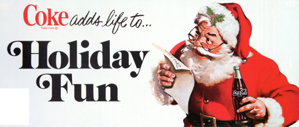
Colour is an interesting tool because it can function as both an organizational tool as well as a personality tool. Bold, contrasting colors on a particular element of a website will demand attention (such as with buttons or error messages or hyperlinks). When used as a personality tool, color can extend beyond into more sophisticated types of hierarchy; Using lush, comforting colors can bring an emotional appeal to a page. Color can affect everything from a websites brand (ie: CocaCola Red) to symbolism (ie: cool, subdued colors).
Contrast
Contrast shows dramatic change within the text and shift within the size or colour showing there is something different within the writing.
Alignment
Alignment creates order and a since of constancy within the text.This is usually achieved with a grid to make it easier to plan out the text within the design.
composition
In the visual arts, composition is the placement or arrangement of visual elements or ingredients in a work of art, as distinct from the subject.
Focus point
One of the key things within composition is focus points as you need to find a spot within the image were you want the viewer to look at like above the main focus point is the woman.
2. Direct the Eye With Leading Lines
Using lines you can direct the viewers eyes to a new part of the paper to see a new subject or more important parts of information within a poster.
3. Scale
Scale is often used to help communicate hierarchy by drawing attention toward and away from certain elements, thus signifying their importance to the communication.
4.Use Elements That Complement Each Other
This is done by using images that follow a theme within the poster or design and making them an ongoing subject within the visual content . You also need to make the text mach and follow this images to make the story work with the images.
Houses of the Holy for Led zeppelin by Storm Thorgerson
I think this image has some animal feel to it within the way the people within it are undressed and wild in the way they have been depicted within the cover making the music seem as if it is going to be wild and untamed. I also think the image holds a feel of progress and everlasting change within the way they are trying to work themselves up a primed like objects within the cover. I also like this pyramid as this draws your eye to the whole of the subject with the perspective within its lines and within the way there slander thin bodies are clinging to it.
My Girl for Madness
This album cover is very good as it shows the whole band and it also makes since what they sing about within the way they have positioned themselves and within the way the layout of the album has been constructed.
Naked for Talking Heads
I really like this cover because of the way the artists has decided to create the cover as if it is a piece of art work within the way he has made a frame around the image making the viewer concentrate on what is within the album cover . I also like it as it looks very realistic within the way it has been made with an idea of prospective within the fame compared to the image of the monkey as they both look as if they could lounge out of the cover because of the way the artists has disjoined them.
Wish you were here / Welcome to the machine
Alternative cover for pink Floyd by Storm Thorgerson
This album cover has been set out to make the viewer’s eye travels within the image due to the colours that compliment each other , lines and way the background colour makes the whole image stand out within the album cover because of the use of a dark colour behind a bright one.
Different class for Pulp
designed by Blue Source
This cover is very simplistic but clever within the way the artists has hidden the musicians within a wedding photo making the viewer have to look for them like a where’s Wally. I also think this artist is clever like the cover for naked in creating a frame as this makes the viewer concentrate on the image and helps with layout within the cover
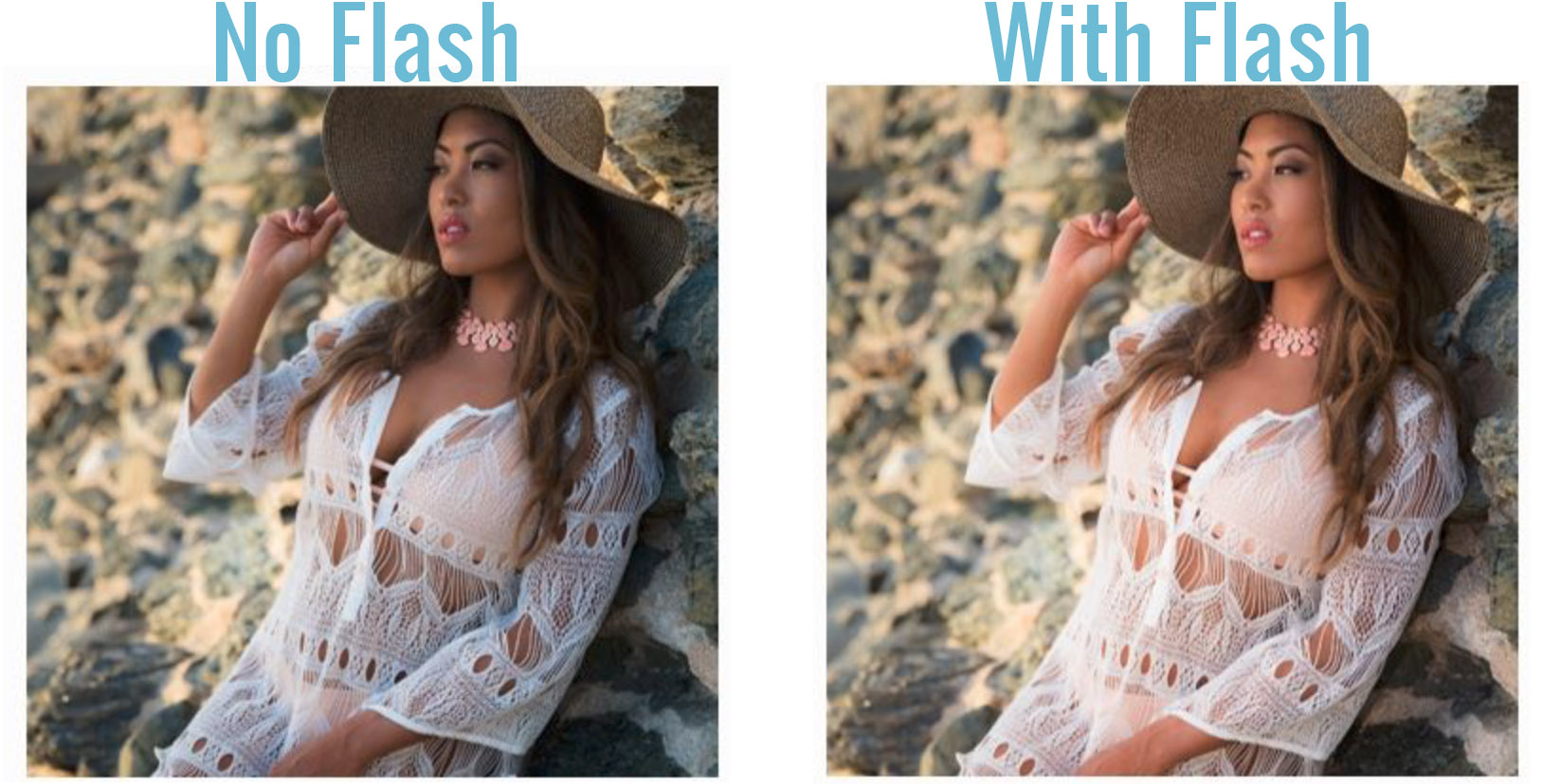
You can control the amount of light within the image and how it effect the image as seen above as the image with no flash is very dark and cast with shadows but the image with a flash is very light and pale to the eye.
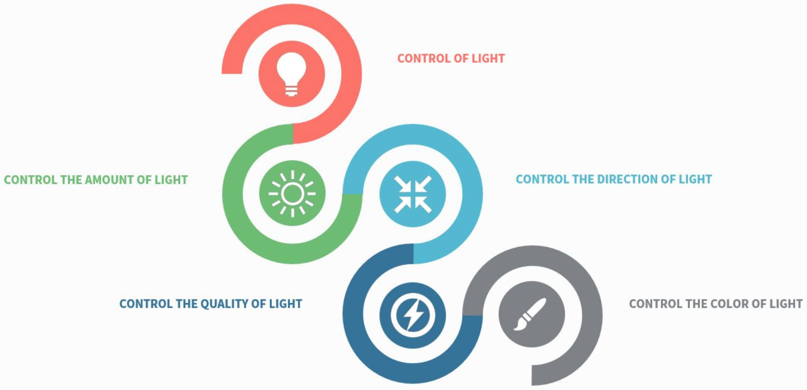
REASON #3: CONTROL THE DIRECTION OF LIGHT
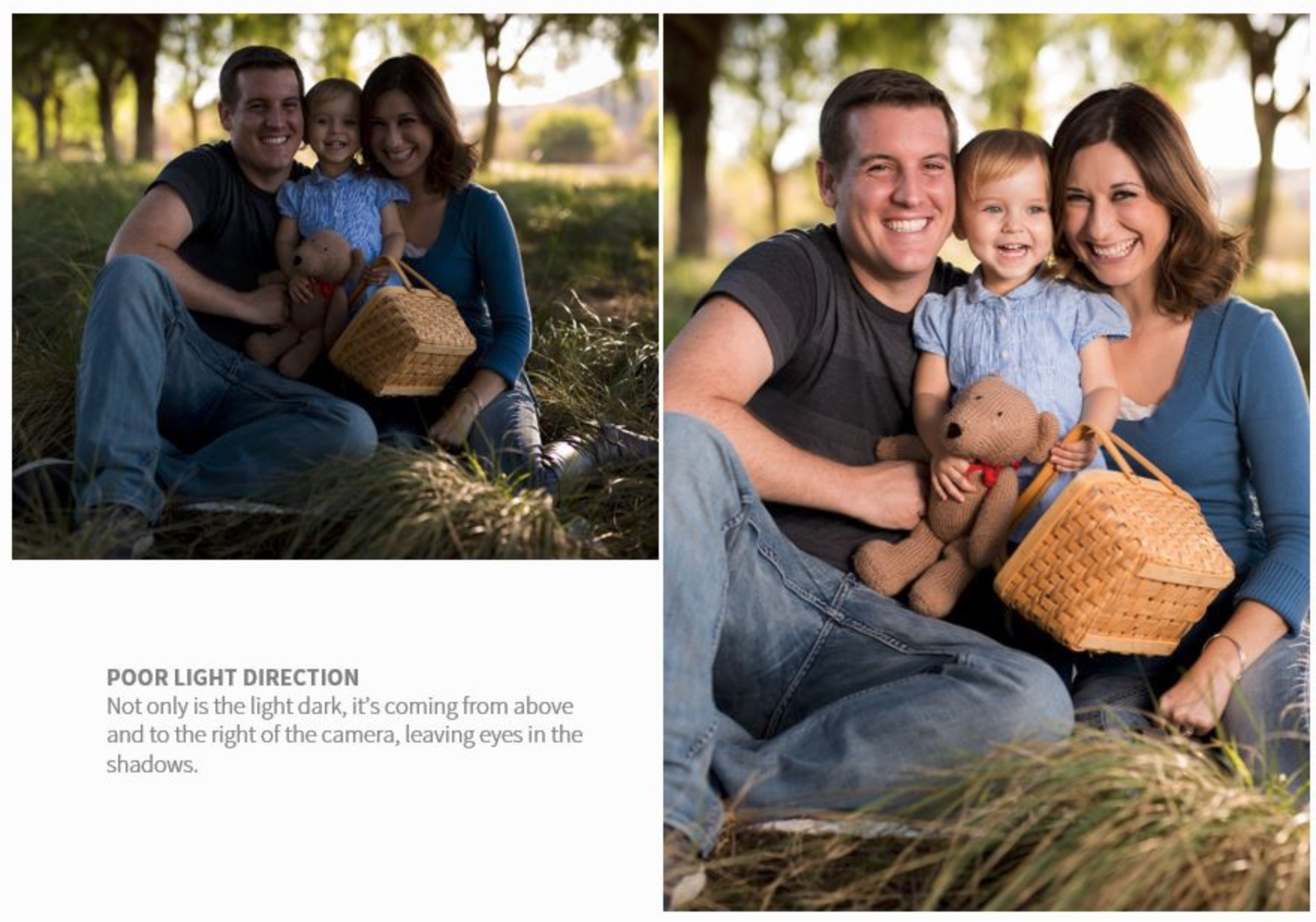
If you are within an area were there is a limited amount of light you can control light with a flash to make the image look more natural and lighter than if you just took the image.
This image above was done by the photographer moving the models within a shadowed area then using the flash to up there highlights and to make the image look more realistic.
REASON #4: CONTROL THE QUALITY OF LIGHT
Using different forms of lighting like natural,unnatural, hard, soft , split,butterfly or flat to create a different and more interesting form of photography that is right for what is needed.
Some flash lighting can be used to create a dramatic light for athletes. This hard light is used to define shadows. Soft diffused flash lighting can be used to direct and enhance the existing light in a scene.
REASON #5: CONTROL THE COLOR OF LIGHT
I had her stand to her side and I then had her place her thumb into her mouth.
This one was a combination of two different posses. I like this poses because of how it difeguers her body making it hard to look at and how it makes her body curve at an angle.
By using flash you can add colour gels to the camera to add colour to the light making the image more interesting and this can be used to warm up the colours within the pitcher if the image look cold and unattractive to the eye.
These are some of the promotional materials I have found within my half term that will help influence my ideas within my next task within the promotion project by the way I can gain influence from layout and text within them.
This slideshow requires JavaScript.
This is a banner that has been placed within the Newquay Zoo to promote an offer to feed the lemurs. I think the banner is very catching within the way they have placed the banner within an exhibit within one of the cages of the animals( the lions). As this catches the viewers attention when they are viewing the animals making you think of the subject. but I do think the banner itself is very not right for were it has been placed as it was placed within the wrong enclosure for what it was advertising and there is nothing visually within the banner to explain what it is for example: images of lamers or of people feeding animals instead the banner relied on text to get its message across to the public making it less attractive to some people within the public because of the reading involved.
This is a leaflet for the the National Marine Aquarium in Cornwall I think the leaflet is very simplistic but ordered cleverly within the way the designer has arranged images of fish within the aquarium within the cover of the leaflet to catch the eye of the public and to show them what type of animals they are expecting within the aquarium. Another thing I like about this is the way the leaflet has been designed with colours that represent the creatures living areas (blue for water) making the leaflet feel more alive and friendly to the eye instead of the leaflet was created with a black or green background this would look strange and confusing to the eyes with this creatures within the leaflets as we all associated this creatures with water.
I also like the way the leaflet has a simple map within the leaflet to show the viewer what to expect and to show them the layout of the aquarium. I also like how thy use arrows and images to show more details within the areas of the map.


Recent Comments