Here is my online magazine.
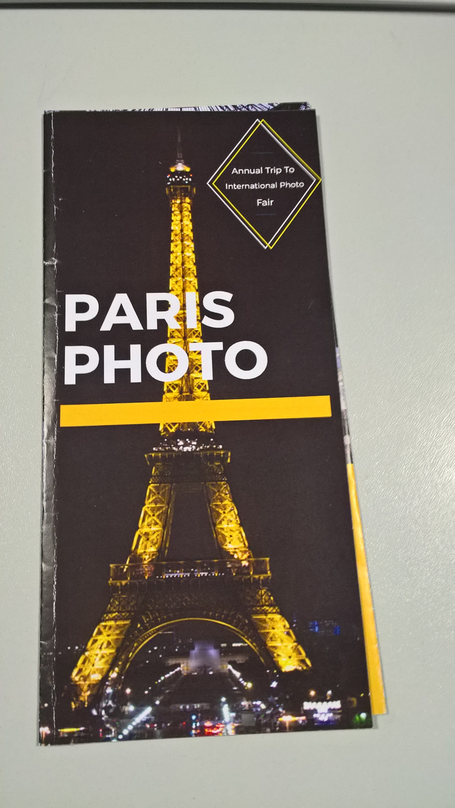
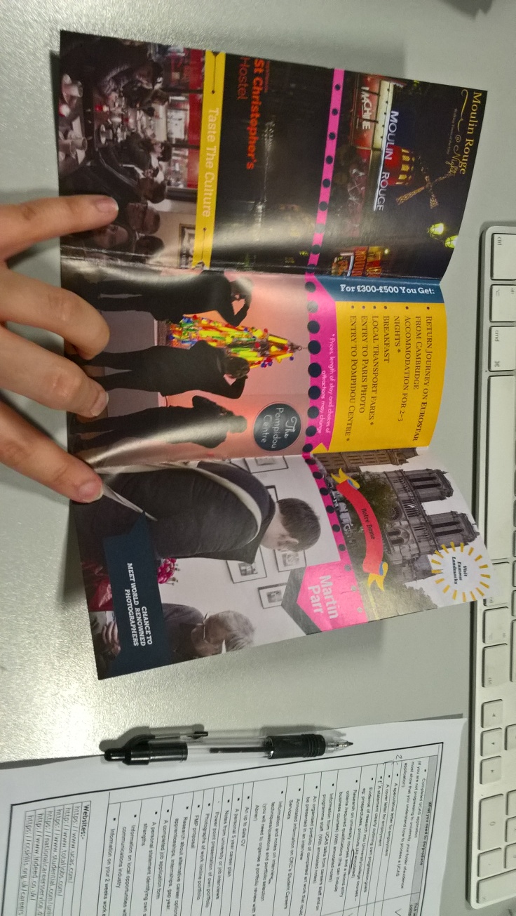
Here is a leaflet I designed for the Cambridge regional college to promote the pairs photo trip. I think I have done well within creating this as it is bold and crisp to the eye and makes the viewer’s eye travel around the design.

This is my magazine I have designed and made for my Wonn 17 project. I think I have done well within constructing this as I didn’t really know how to use indesign and I found it difficult to get the layout and typefaces within my magazine to look professional to the eye. I started constructing this by opening inDesign and arranging my magazine layout to be 12 pages and for the grid to have 6 columns and 4 rows within it to help with placing text and images within my pages. Once I was in inDesign I then used the master pages to change the colour of the background within the magazine to black and to add the page numbers by making a text box within the corner and selecting the add page marker within the edit bar.

This is my front cover I like the way I have constructed it as it draws the viewer towards the image with the way the writing has been formed in a right angle format making you look around the page. I did this by first placing the image within the middle with a box and then thinking about the layout of the text as I wasn’t sure how this would look with text around it so I experimented. I then decided that the best text for my front cover would be simpler text that would work more with the image so I decided to work with a font that was something like Sans within the title and to use reds and pinks to compliment the dark colour’s of the background. After this I then used lines and shapes to add more feeling to the page by creating a border around my image and to underline the title to give it its own life.

I started the first page within Wonn17 by placing an image of the Cornwall cost that I took within the first two pages and then making up an index and a space about what the book is about by writing within text boxes then placing them within arranged areas that suited the layout.I then decided to add a quot by a famous photographer or artist in the end I decided to use a quot by Twyla Tharp as I found her quot very inspirational and suiting to my magazine. I then placed the quot in by drawing a line across the page and using the horizontal text tool I then write in the quit on to the line. I then used the pen and the selection tool to manipulate the text to curve around the photo within the background. I then decided to finished off my page by placing some boxes within my page behind my text that were light and dark pink to help the text stand out and to give it a border to the eye. I first started within these pages by thinking about how my image would sit to the text as I wanted the pages to combined features of each other and to make the viewer have to wonder around the page within an arranged infrastructure. I did this by fist placing my image on the left hand side then with the shape tool, I then placed a square behind it that i then turned white to make it standout from the background. I then turned my thoughts to the text , I decided I didn’t want the text sitting there on the black background so I decided to create a group of coloured squares with the shape tool to decorate the background and to make the text standout to the eye. after this I then placed in the text using the text box and the grid to arrange them within my squares, I also decided to make their colours white and orange as I thought this went well with the colours of the squares. I then finished it off by placing two coloured lines throw my image to attract viewers to look at my image as it points to the photo and to make the pages connect to each other.
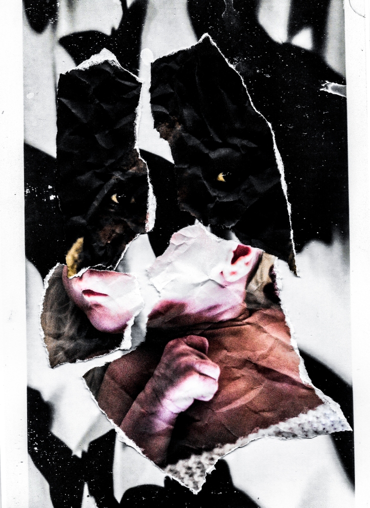
this is my favorite page due to the background as I created this by using the shape tool and drawing hexagons then arranging them within a way that looked retro to the eye. I did this by first placing them behind the image I then decided to change their colours to a form that would match the colours within the photo. I also added lines within the shapes by placing smaller shapes within the hexagons and then getting rid of their fill and upping their outlines. once I had placed in all the shapes within my pages I then placed in my text boxes for the title and for the text. I did this by making two coloured squares keeping to my theme and placing the text within each of these. I also added a thin pink line under the title (confused baby pie) as I thought this would help people’s eyes travel towards the photo and to the title.
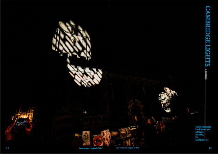
For this page I decided to keep it simple as I wanted a page were the image was the only subject within the pages and the viewer didn’t have any writing nor shapes to see within the page except that within the photo so I decided to only have the detail of what the settings were when the image was taken within the corner of the photo on the page making it simplistic as I could.
I started this by frist placing the image within the middle of the two pages and moving it slightly to the left I wanted the image to be the biggest thing within the pages as I wanted it to be the most dominant piece within the pages compared to the text and shapes. I then decided to place in the shapes within the background to add a feeling of colour and a feel of retro within my piece. I did this by using the shape tool to make squares then arranging them in a slanted angle to the left corner to the right making a line. I then decided to form a collection of boxes within the right hand side for the text and the title adding feeling and texture to the page. I then decided to use the line tool to add lines under the title leading to the image making the viewers eyes travel to the photo and take their time within the page.

I wanted these pages to show a tight frame within the way they were laid out so I decided to start developing this by creating the background using the squares like the other pages. I then placed in the title within the right hand top corner . After awhile I decided to change the layout of the title as I felt it didn’t look professional and wasn’t showing respect to the image so I decided to change its layout by having the (on the ) in smaller writing and different colors away from the rest of the title to make it look less important and to uplift the rest of the title. the image I placed within this was made with a speed light and a colour gel I created this within a beach in Cornwall.
This is another page I decided to make in a simplistic manner as I thought the image would look better in a bigger format and the page would look more suitable with less writing within it so I decided to place the settings I took the image within the right hand bottom hand corner and I then decided to make a title for this within the right hand side going done by using a line then writing the text down on the line.

I decided to have a bio within my magazine as I thought this would add character into my magazine and would make the viewer understand me more within my pages. I did this by placing a self portrait of myself within the left hand side. I then placed a text box next to the image of me and place the bio I was working on within this to express me. I then decided to create a title by making a white box above the writing and having a bold red line half way to the bottom to cut the box from the text and to make the title stand out from the other words within the page. when placing the words within the title I decided to make them three different colours as I thought this would make the viewer’s eye follow the page better and would make the page look more organized to the eye.

I decided to make my back cover based on my logo for my promotional project as I wanted it to promote me but at the same time look stylish and retro so I decided to use the grid system to layout two squares within my back cover wich were orange and white . I then manipulated them and added to red lines over them to each sides to make a border, making the images look as if it was a frame or a piece of art. I then decided to add in the logo and to writ within small letters underneath ( sponsored by ) as I thought this added to the photo and gave feeling to my work. Continue reading “Wonn17”
To find my skills within inDesign I decided to uses a number of different magazine covers to replicate within my own image to gain my ideas on how to create my own cover within my own magazine.
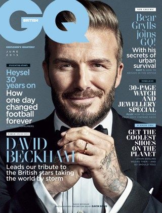
I decided to use the GQ British fashion magazine to start with as I wanted to first try something that showed some form of similarity within the writing to start with.

I started creating this by placing in one of my own images that looked simpler to the original image. I then decided to place down a grid by going to insert create grid to form a grid for me to work with. After this I then decided to add the logo by placing a text box within the left top side corner then placing GQ within it and increasing its size , changing its font and colour to make it like the original.
After this I then added in the text by placing in the text boxes in the left and right sides of the magazine cover and filling them with text from the original magazine that I copied in. I think I have done well within this in capturing a close similarity with the original magazine cover as I think I have done well within positioning the text and with finding simuler font. 
My second cover was from the magazine hunger as I wanted a simplistic image to give me an ideas on how to arrange my covers within a simplistic manner that would internet my viewers.

I started copying this by creating the background within inDesign by using the rectangle tool to make a square to cover the whole of the background I then changed the colour of this to a light hue of pink. After this I then decided to place a grid on top of the page to help me arrange my text and imagery within my own cover. I started this by finding one of my images that I thought would suit the type of cover and then placing it within the center of my page using the grid I had just made to help me arrange it in the center. After this i then placed the title within the cover by finding a font that was similar to the one in the cover i was copying. I went for a Sans font in the end as I felt this was bold and more like the text within the original magazine cover within shape and texture. I then decided up the size of the title and to reorganize it to fit with the original.After this I then placed the text within the cover using text boxes and arranging it using the grid.

This is my seconded hunger magazine cover I recreated using inDesign .

I decided to use my image from Audley End as I thought this looked more like the image on the front cover of Hunger and I also liked the way his facial features were acting within the photo. I started this image by first making a grid then placing the a box around the whole of the page and inserting the image creating a background. After this I then decided to work on the title by using the pen tool to draw on the words and the manipulating the words with the selection arrow to make them look more artistic. I then added lines under the writing to make the image look as if it was paint dribbled. I think I can improve within my cover by working more within the title as I think it looks untidy to the eye and I think I need to paint the letters by hand then scan them in to make them look more life-like.

I decided to copy the Vogue Paris cover as I liked their design compared to the British version.

I started to replicate the original by first placing my photo I thought looked most like the original within the background then placing a grid on top to help place my text within my cover.I then decided to place the title within the cover by making a text box with the top of the cover then placing the words Vogue . I then increased its size and changed its colour and font to one that represented the original. after this I then made the Paris by drawing a small text box within the O of the Vogue and writing Paris, after this I then changed the font to an old style and the colour. After this I then started to add in the text by inserting text boxes within may cover then placing text from the original cover within them and placing them within the right arrangement of the cover. After this I then manipulate the text by changing its arrangement,size,font type and colour. To finish this off i placed a box within the corner and placed a bar code to make it look real.

With this cover I decided to go for a simple cover as I wanted another cover that expressed how you can create a cover in a manner that is simple but recognizable to the public.

I did this by making a A4 page in a landscape layout, then placing a box over the whole of the background and inserting one of my image of a man. After this I created the title by placing a line horizontally down the page I then used the text box tool to stick to the surface of the line allowing me to type horizontal down the page the I-D. I then made sure the text was the right shape size ,font and placed it to match the original. I think I have done well within this by getting it very powerful within the way the image looks at you and the way the text is entered identical to the original.

For my last cover to copy I decided to copy a very artistic cover from I-D as I wanted to gain some idea on how to form a more art based cover then just a photography based cover.
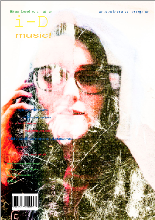
I first started this cover by first placing the image over the whole of the cover I then placed the grid on top as I decided to use this to help within arranging my text within my design.
After this I then made the title by placing the text box in the top hand corner and placing the words I-D and changing its font face,colour and size to fit the same as the originals. I then turned my attention to text and how to lay this out within my own make by placing the text boxes within the layout of the cover and then placing text from the original within it. I also tried to do the curve writing within the original but I struggled to make this as I couldn’t figure out it at the time how to turn the text but I did manage to find out this latter on within a later cover. I finished this off by creating a bar code within the left hand corner by inserting an image of one from the internet then resizing it to fit the size of the layout of my cover.
These are images I took while away in Cornwall for my coursework and for fun.
Here are some of the originals
Here are some of my edited versions.
Here are my Dada ideas I have done for an idea for what to have within my magazine for my Wonn17 project and to experiment with new and exciting ideas in and around photography / art.


These are my edited versions.


 This is the tool used to arrange text around images within inDesign you use this by selecting an image then getting the tool up within the windows bar and using the arrows to move the text around the image.

I started practicing this by making a square using the rectangle tool within the center. I then placed a text box within the whole of the page and filled it with placeholder text. After this I then used the text wrap to adjust the square and to mess around with the positioning.

after this I then tried this on a circular shape to see what would happen. by placing a text box over the whole of the page as before and then placing a circle in the middle using the circle shape tool. I then used the circular text wrap to make a circle border around the circle from the text.

after trying out the text wrap with shapes I then decided to try this onto a real image by inserting an image without a background within a page of text that I had placed down like before. I then selected the image and went to the text wrap and changed the type button to detect edges so the image would be selected instead of the outside. I then used the selection arrow and the pen to manipulate the anchors within the border pushing out the text. 

I made the text in the unusual text box above by using the pen tool to form an uneven shape near the image making sure all of the lines were connected. I then selected it and inserted placeholder text within it turning it in to a text box.

After this I decided to move some of the anchor within the shape by using the selection arrow to move anchor manipulating the shape of the layout of the text and I also decided to remove some of the anchor by selecting them and pressing the delete button changing its shape.
These are different ideas I have made for posts ,pages and other forms of promotion for my social media websites to advertise myself and my works.
Facebook ideas

I like this one due to it being up close and personal showing what I can do but I feel as the image is of food people may get confuse on what I can do within photography and if I am really a photographer.

This is another idea I had to have my logo behind my name to make it bold that I am a photographer and my name / business is clear to the viewer.
Linked in cover
I decided to make this within a black and white format as I wanted it to have an old fashion feel within it but I also wanted it to look attractive towards my customers/ viewers.
Posters

I think I have done well within this as I like the way I have got a range of colours and how I have created it within a simple manner making it easy for people to read.
Instergram

I really like the border around my image as I feel this brings out the image and I also feel the writing that I changed to fit with my theme connects to the theme well and makes the viewers eyes travel around the page.
- Layouts
The way in which text or pictures are set out on a page.
- Baseline Grid
The baseline grid is a technique used to better your web-based typography. Essentially, it aligns all your text to a vertical grid where the bottom of each letter is positioned onto the grid, just like writing on lined paperBalance – Symmetrical & Asymmetrical

- Folio
The folio is the writing at the bottom of the page usually the date or the magazine number.
- Formatting
The arrangement of data for storage or display.
- Margins
Is the edge or border they help to form a grid.
- Body copy
Body copy is the main text part of an advertisement or any printed matter (as distinct from the logo, headline, subheadings, and graphics) that provides the ‘meat’ of the communication. Usually a professional copywriter writes the body copy.
- Drop Caps
A drop cap is a decorative element typically used in documents at the start of a section or chapter. It’s a large capital letter at the beginning or a paragraph or text block that has the depth of two or more lines of normal text. Drop caps are easy to apply in Word.


Recent Comments